
The "dome shape" of recent inflation
The "dome shape" of recent inflation
(I couldn´t find anything similar from the past)

This is the picture considering three alternative measures of inflation: the Harmonized index of prices, the Hedaline CPI and the Headline PCE.

Note that the “round-trip” is almost complete for the CPI & PCE, while the Harmonized Price Index (HPI) has “finished the race”. (The HPI is essentailly the CPI ex shelter. For details about the different indices, see here)
A common interpretation of the “Dome shape” is summarized in this comment by Sam Levey:
This timing is part of why I don’t think “the Fed did it.” If inflation and disinflation play out on similar timescales, then to me it seems more likely than not that they were the result of similar forces, like supply shocks coming then going.
You must remember, however, that inflation began to go “above board” only one year after C-19 hit. By that time, vaccines were becoming available and lockdowns relaxed. Also, the Global container freight rate index, a measure of supply chain disruptions, which rose by a factor of 5 since the start of C-19, peaked a few months later.
In fact, when C-19 hit, for the first few months all measures of inflation fell, despite the supply “disruptions”. Even oil prices tumbled. And for the rest of 2020, into the first months of 2021, inflation slowly climbed towards the 2% target and so did oil prices.
The charts below illustrate the “pre inflation” period. Note that inflation behaves in an approximate “inverted dome fashion”.

Would Sam Levey argue that “that´s not the Fed´s doing” because while disinflation & “reflation” play out in different time scale, with disinflation taking place more quickly than the subsequent “reflation”, positive supply shocks came “more quickly” than they “went away” that time around?
That would be absurd! There is a simple identification procedure for supply and demand shocks. While in the case of a demand shock, output and prices move in the same direction (if positive, both increase), in the case of a supply shock, output and prices move in opposite directions (when positive, output increases and inflation falls).
It is, therefore, clear that the first few months after C-19 hit, the economy experienced a mammoth negative demand shock! For the rest of 2020, and into early 2021, what we observe is the unwinding of the negative demand shock, with both output and inflation rising back to target. In other words, an economic recovery.
The next charts help define the process since C-19 hit in early 2020. The first chart illustrates the behavior of the NGDP level, where a fall in the NGDP level denotes the presence of a contractionary monetary policy (a demand shock) and a rise in NGDP level denotes an expansionary monetary policy. Then there is the level path of NGDP. When NGDP is rising back to that level, monetary policy is being expansionary, but although I call it a “demand shock” for simplicity, it really is the “undoing” of the prior monetary tightening.
When NGDP expands above the trend level path, monetary policy is deemed “excessively expansionary”. That is clearly a demand shock, where both real output (RGDP on the second chart below) rises together with inflation. Supply barriers or impediments may have enhanced the increase in inflation, but that is a consequence of the expansionary monetary policy pursued by the Fed.
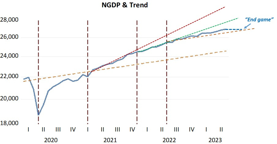
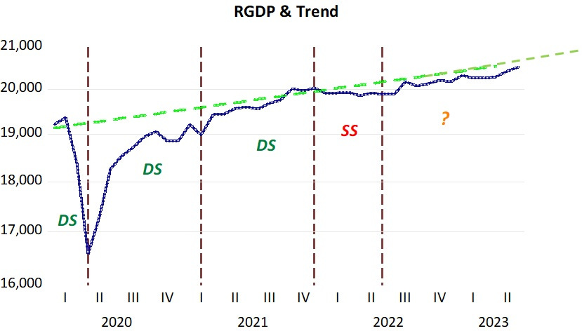
The instance of a supply shock is clear, because while RGDP drops inflation rises. That “dominates” the negative demand shock reflected in the fall in NGDP growth (indicated by a less steep dotted green line).
It is clear that for most of the period until the end of 2021, the inflation process mostly reflected demand shocks. A supply shock was mostly due to the Russian planning to invade and the actual invasion of Ukraine at the end of February 2022.
The next two charts illustrate inflation and oil prices.


Where you note that a rise in oil prices cannot always be called a supply shock. Frquently, as in the first year of C-19, the oil price moves reflect demand conditions. That´s also true during most of 2021, when oil prices rose due to “demand pressures”. Going into the Russian war period, oil prices increase more forcefully, negatively impacting supply and enhancing the rise in inflation, a clear instance of a supply shock.
For the last period of the chart, covering the months since mid 2022, I put a question mark. During this period, oil prices fall (and supply restrictions relax more). Real output rises to approach trend, and inflation begins to fall. Those moves are consistent with a positive supply shock.
On the other hand, NGDP growth is also reduced, approaching the 4.5% growth path at a higer NGDP level. That contributes to the reduction in inflation and “holds” increases in real output. So there´s a mixture of positive supply and negative demand shocks, both having the effect of reducing inflation but working in opposite directions with regards to real output (RGDP).
Oil prices may stop falling (and even rise). Will that reverse the path of inflation? Some hold that the continuing fall in inflation towards the 2% target is still in doubt (here and here).
As I´ve argued previously, the Fed is very close to making a “soft landing”, something that will happen if it “lands soothly” on the “4.5% runway”. If it keeps the economy on that path, inflation will consistently fall to target. With nominal stability attained, supply impediments will wane faster and real output may reach a higher level. Other real variables like employment will also benefit.
Let´s hope the Fed avoids “overshooting”!
Divisia Aggregates rates-of-change clearly underweight velocity - just as they did in 1981.
The fall in money demand also corroborates Dr. Philip George's theory in "The Riddle of Money Finally Solved" ( the ratio of M1 to the sum of 12 months savings ).