
In "Stagflation Revisited", Krugman never mentions money
In "Stagflation Revisited", Krugman never mentions money
Instead of an "unemployment fetish" a "money fetish" is better

In his debut Substack post, Paul Krugman published “Stagflation Revisited - Did we get the whole macro story wrong?”
His basic argument is that according to research by Emi Nakamura, the Phillips Curve has always been very flat.
What the Nakamura et al analysis suggests, however, is that it was always very flat.
And that, apparently, led us to be wrong about the “whole macro story” of the last 50 years!
First thing to note is that the 70s was just the “inflationary decade”, there was no “stag” to it. Real output grew at an average of 3.2% over the decade, the same as during the “Great Moderation” (GM) between 1987 and 2006. The difference, and that´s where the moniker comes from, is that during the GM the volatility (standard deviation) of growth was cut in half.
On the other hand, while in the 70s Core PCE inflation averaged 6.2% (with standard deviation of 2.4), during the Great Moderation years it averaged 2.4% (with standard deviation of 0.9).
Krugman revisits the 70s and the 80s. I´ll start with the 70s (he starts with the 80s).
Revisiting the 70s
The truth is that I’ve always been a bit uneasy about the standard story of inflation in the 1970s…My uneasiness came from the sense that the economy never seemed to run hot enough to explain such a big rise in inflation.
Nakamura et al couldn’t extend their analysis back to the emergence of stagflation, because the data aren’t available. It seems pretty clear, however, that the flat Phillips curve they find would tell us that overheating can’t explain the inflation surge. So what happened?
The natural explanation would emphasize supply shocks… Maybe these supply shocks led to a rise in headline inflation which caused expectations to become untethered. We don’t know if that’s true…
But suppose something like this is true. In that case, the narrative that saw stagflation both as the cost of excessively ambitious macroeconomic policy and as a vindication of conservative economic ideas was mostly wrong. And that matters not just for history but for policy right now, which is still to some extent constrained by the fear of a 70s repeat.
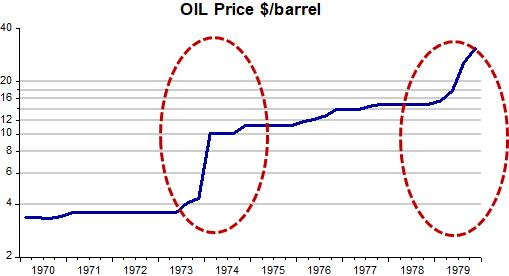
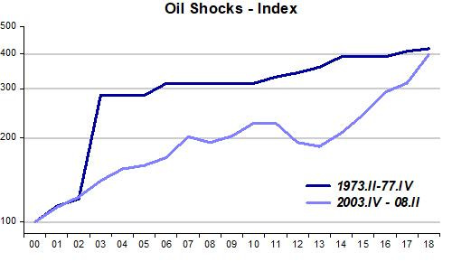
The set of charts below summarize what went on during the 70s. The first chart illustrates the oil shocks that hit in 1973/74 and then again in 1979.
As we know from the dynamic AS/AD model, a negative supply shock (like oil price skyrocketing), shifts the aggregate supply curve up, increasing inflation and reducing real GDP growth. The second chart shows this dynamic.
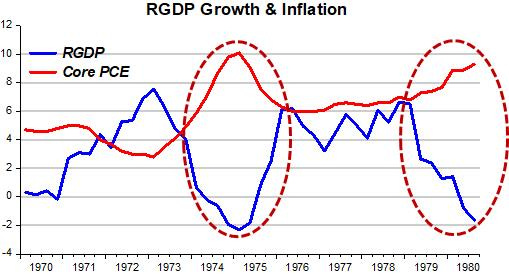
The drop in output growth is sufficient to cause a steep rise in unemployment.
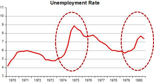
Note that after the first oil shock, when oil prices increased by a factor of almost 4 very quickly, inflation comes down and growth picks up strongly. With the strong pick up in real growth, unemployment (and inflation) drops significantly.
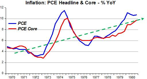
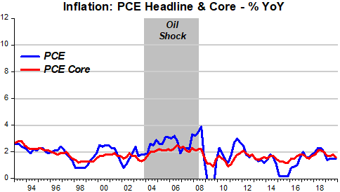
The growth/inflation chart above shows that core inflation spikes when the oil price shocks hit, but inflation was trending up throughout the decade. The next chart illustrates an inflation process, in which all prices increase, with both headline and core inflation trending up.
Krugman wants to know what was behind the rising inflation since the economy never ran hot enough to justify such an increase in inflation.
If he looked at what was happening to money and monetary policy, the answer would “jump-out”. A stable nominal environment requires a monetary policy (money supply growth) that adequately offsets changes in velocity in order to keep nominal spending (NGDP) growth stable. The next chart shows that instead of nominal stability, nominal spending growth was trending up. That explains the up trend in inflation.

Now, jump ahead in time. The next chart shows that the magnitude of the oil shock that began in late 2003 and lasted to mid-2008, was of exactly the same magnitude as the oil price increase in the four years to 1977. What differs is the time distribution of the shock. This certainly has an impact on the size of the inflation spike, but in the 2000s shock, while headline inflation rises, core inflation remains contained and stable (the inflation chart for the 70s and this one have the same scale for easy comparison).
That is the result from having the Fed pursuing (even if implicitly) nominal stability, where nominal spending (NGDP) growth remains relatively stable and does not show a trend (the scale is the same as the NGDP growth chart for the 70s above).
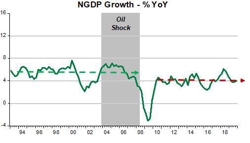
Note that after the Great Recession, the stable growth of NGDP is significantly lower than that observed prior to the GR. Given that during the GR the level of nominal spending fell, the fact that nominal spending growth thereafter stayed below the previous growth means that NGDP has been rising at a slower rate and at a lower level than previously. That´s why I call the post GR period one of “depressed stability”.
What does Krugman says about the 80s?
Revisiting that 80s show
When the Great Recession struck, many people, myself included, worried about deflation. (Many other people, especially gold bugs, worried about inflation; but never mind them.) We expected a Volcker-era-like period of very high unemployment to cause a Volcker-like decline in the inflation rate, which would have put us substantially underwater. But while there was some decline in inflation, it wasn’t very big. Nor did inflation rise by much as the economy reflated, even when unemployment dropped below 4 percent.
I wouldn´t say the drop in inflation in the GR wasn´t “very big”. After all, core inflation initially fell by more than 50%! (from 2.2% to 0.9%), It then climbed to average 1.6% over the next 10 years. That´s not terribly lower than the 1.9% core PCE averaged from 1993 to 2007, before the GR, despite a significantly lower level & growth rate of NGDP.
Krugman goes on:
There is, however, a problem. The estimated slope of the Phillips curve is so flat that it says that the unemployment bulge of the early 1980s, big as it was, isn’t enough to explain the Volcker disinflation.
So what does explain the disinflation?
As you would imagine, the same “thing” that explained the 70s inflation: Monetary policy.
The charts below illustrate the whole period from the 70s inflation. The “guideposts” in the charts save me from writing many words!
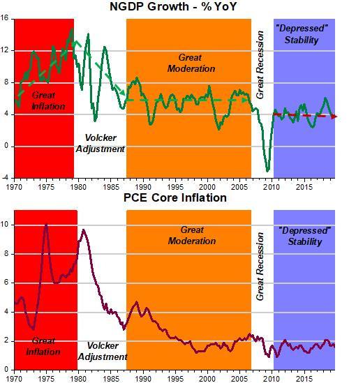
Bottom line: There´s no relation between inflation and unemployment. During the Volcker/Greenspan years, inflation was viewed as a monetary phenomenon, so inflation was “conquered”.
In fact, the Powell Fed has not helped by changing the the monetary framework from “IT” to “AIT” (discussed here):
They do not have to focus on the labor market, like Powell suggests in his speech.
If he does so, the risk that he´ll get monetary policy wrong increases significantly. The result could resemble the 1970s, when Arthur Burns, “oblivious” to the fact that inflation is a monetary phenomenon, completely lost nominal stability, with NGDP growth showing a continuous uptrend.
Two things to bear in mind when comparing the big impact of the 1973-77 shock with the small impact of the 2004-8 oil shock.
1. The impact of the former was amplified by widespread rationing. Rationing is not efficient compared to letting businesses decide for themselves how much to conserve in response to a price signal.
2. The impact of the latter was moderated by the relatively low weight of oil in GDP in 2004-8 compared to 1973.