What´s up with inflation in the post C-19 world?
Few people talk coherently about it. I hope I´m in the minority
The idea for this post came from the article and tweet by Jeanna Siamalek, an economics writer for the New York Times
@jeannasmialek
Inflation took off in March 2021 because of a statistical quirk. Then it was about goods shortages. Then the war in Ukraine. Yet the through-line in the shifting story was strong demand: People wanted to buy things, and that gave companies the ability to charge more.
When “statistical quirks” become reason for inflation “taking off”, something is very wrong with the way we think about inflation. I won´t go into it here, but all the craze about “partitioning” or “decomposing” inflation by category of prices and over periods (YoY, MoM, 3 or 6 mo averages, among others) is also very disturbing and brings no “light” to an understanding of what´s going on with inflation.
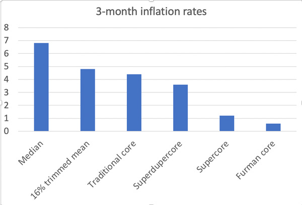
This chart put up by Krugman a few months ago illustrates the point.
My “inflation in the post C-19 world story”, is heavily illustrated so as to make my arguments as clear as possible and allow the reader to “see” the ongoing inflation process as if they were watching a movie.
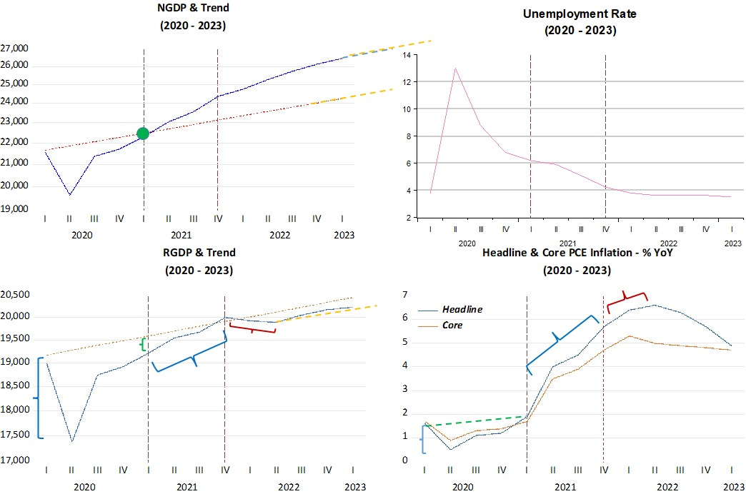
The panel below shows the major macro “outcome” variables from the “monetary policies” undertaken. Those are 1. Aggregate nominal spending (or NGDP), 2. Real GDP (RGDP), 3. Unemployment rate and, 4. Inflation (both “Headline & Core PCE expressed as % YoY). Both NGDP and RGDP are expressed as levels (relative to the trend path that prevailed since the end of the Great Recession in mid-2009)
The symbol “{“ represents “shocks”. When blue, they denote “demand shocks”, when red, they denote “supply shocks”, when green, they denote “supply restrictions” (from lockdowns or supply-chain disruptions, for example).
First point: How do we distinguish between Demand (or nominal) shocks and Supply (or real) shocks?
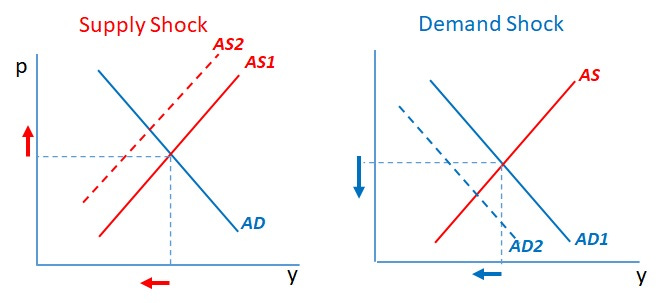
That is given from looking at the Dynamic Aggregate Supply/Aggregate Demand model. I give a stylistic representation below, with y denoting RGDP growth and p denoting inflation. The basic conclusion is that, in the case of a “supply shock”, output growth and prices move in opposite directions, and move in the same direction in the case of a “demand” shock.
Initially, C-19 represented a massive demand shock. Both real output and inflation fell, the “hallmark” of a demand shock. What caused it? Money demand increased “majestically” (velocity dropped abruptly). The Fed cannot be “blamed”. It would be impossible for monetary policy to react that quickly to increase money supply growth to offset the sudden surge in money demand.
Things worked well because just two months later, the economy started on the path to full recovery (where it goes back to the level trend path it was “travelling” on). Inflation also “travels back to “target”.
By late 2020, early 2021, aggregate nominl spending had fully recovered, with NGDP back on the level trend path. Something, however, appears to be “blocking” the “supply road”. Those “barriers” to supply are the C-19 related lockdowns, fewer trucks, trains and ships, among other “barriers”. I don´t consider those “supply shocks”. They are more akin to “barriers”, impediments”, or “restrictions” to supply.
In December 2020, The Economist published an article “A surge in inflation looks unlikely - But it is still worth keeping an eye on”, which captures that spirit:
On December 3rd Bill Dudley, who was until 2018 a vice-chairman of the Fed’s interest-rate-setting committee, warned Bloomberg readers that sharp price increases might be necessary to balance demand with the available supply, which the pandemic has undoubtedly diminished.
At that point, inflation had recovered back to target, being somewhat above the level which had prevailed before C-19 hit (indicated by the positive but small inclination) of the green dotted line in the inflation chart). But then, the Fed promoted a positive demand shock, meaning the aggregate demand curve shifted up and to the right. Likely the Fed thought at that point that the unemployment rate was still too high.
With aggregate demand shifting up, producers faced an incentive to “circumvent” supply restrictions and try to bring more people, trains, trucks and ships into action. Barriers to service production remained, since “face to face” encounters still presented “danger”. That is reflected in the ratio of consumption of goods to services which had secularly trended down and now reversed direction.
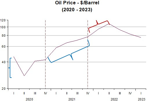
During the interval between the two dotted vertical lines (Dec-20 - Dec 21) the economy experienced a demand shock. Both inflation and real growth move in the same direction. So why did headline & core inflation show some divergence? Note that oil prices were rising, but that, however, does not constitute a “supply shock”, being the result of the generalized increase in aggregaye demand, just like the initial fall in oil prices, when C-19 hit also reflected the fall in aggregate demand, as illustrated in the chart below.
With the start of the Russian invasion of Ukraine, we witness the first & only supply shock for the post C-19 period. Output and prices move in opposite directions. This mouvement is short lived because soon core PCE inflation peaks and slowly falls and a little later, both oil prices and headline PCE inflation strongly reverse direction.
These mouvements also reflect the change in monetary policy, and I´m not talking about interest rates that began to be pushed up in March 2022. I mean the actual reduction in the growth of nominal aggregate spending (NGDP) that is reflected in the kink observed in the NGDP chart above at that point.
Turning to monetary policy proper, my aim is to show that behind the moves in inflation seen in the second chart above, the conduct of monetary policy (or how it should stive to obtain nominal stability, especially when the initial loss of that stability was not due to monetary policy error) is key.
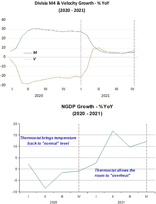
The first set of charts below show that monetary policy first was successful in increasing money supply to satisfy the big increase in money demand (drop in velocity). Aggregate nominal demand quickly rises back to the level trend path it had “dropped” from. Inflation also rises back to the “target” level.
Then monetary policy errs in generating an excess supply of money (nominal or demand shock), so that the “room”, “house” or economywide temperature rises, with NGDP moving above the level trend path and inflation increasing as would be “natural”, especially with supply “impediments” in place.
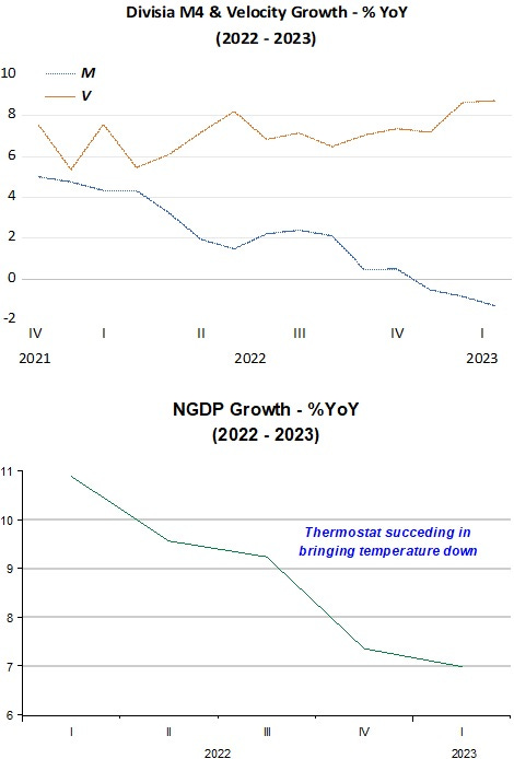
The next charts show that after the second dotted vertical line in the charts above, the stance of monetary policy changed (note that happened before the first change in the Fed Funds rate). From that point on, while velocity changed little, money supply growth has taken a “convincing” downward direction, even turning negative more recently.
Contrary to what the “only money growth matters” crowd is saying, that does not necessarily spell a recession! By “drawing down” the excess money supply, it has been, effective in bringing the “house” temperature down. Inflation has followed suit, as is “natural”.
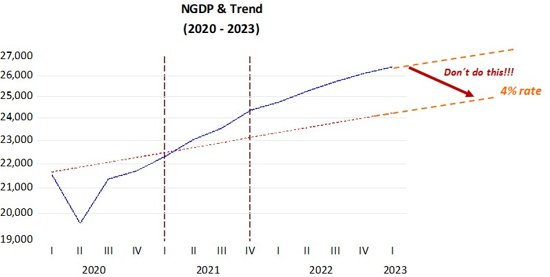
What are the Fed´s options going forward? Insisting, even if maybe for little more time, in raising rates which has had, so far, little effect on inflation but has inflicted relevant “collateral” damages, or pay more attention to achieve balance between money supply and money demand so that the “house temperature” drops to an “agreeable” level (where NGDP growth converges to the 4% growth rate)?
Putting up the NGDP level chart from above to better illustrate,
To minimize adverse effects, monetary policy should strive to reach, and then maintain, a stable rate of NGDP growth around 4%YoY. What it shouldn´t try to do, and sometimes Powell and his “officers” seem inclined to do, in a rush to get inflation to target, is to try to push down aggregate nominal spending to the pre C-19 level path.
That would certainly cause a serious recession, with NGDP growth going negative for a period. and a strong rise in unemployment, but inflation would fall more quickly.
Back in 2008, Bernanke´s Fed, after the too tight monetary policy which generated a big excess demand for money, did not try (for fear of a temporary increase in inflation) to get NGDP back on the trend level path that had prevailed for two decades, choosing to keep aggregate spending travelling along a lower trend level path. That was also a choice that allowed them to eschew “blame” for the crisis!
In short, people and pundits can argue about what is the “right” measure of inflation, or if it´s mostly demand or supply generated until “kingdom come” As always happens, when the matter of concern is inflation, it´s all Up to the Fed!


"the drawdown in inventories actually reduced the headline GDP figure by 2.26%,"
Not to be repeated.
Money matters. Core inflation peaked at the same time as long-term money flows peaked. I.e., the correlation was synchronous. I.e., the distributed lag effect was, once again, an historical, or mathematical constant.
2021-01-01 1.7
2021-04-01 3.5
2021-07-01 3.9
2021-10-01 4.7
2022-01-01 5.3 peak
2022-04-01 5.0
2022-07-01 4.9
2022-10-01 4.8
2023-01-01 4.7
The rate-of-change in short-term money flows, the volume and velocity of means-of-payment money, the proxy for the real output of goods and services, the 10-month roc, must be negative to start a recession.
https://centerforfinancialstability.org/amfm/Divisia_Mar23.pdf
is already in recession territory.
Core inflation peaked at the same time money flows peaked.