Using consistent monetary & inflation indicators to compare outcomes in the Euro Area and the US
Divisia Monetary Aggregates & Harmonized Price Indices

And monetary policy appears to account for the lion´s share of the differences!
To do the comparison, I look at the stance of monetary policy in both “continents” through the lense of Friedman´s “thermostat analogy”, where the “thermostat” is the growth in the money supply, the “outside temperature” is represented by changes in velocity and the “inside temperature” is the growth of aggregate nominal spending, or NGDP growth.
The “thermostat” is under the control of the central bank and a well functioning thermostat is one that keeps the inside temperature stable, and it does so by offseting changes in the outside temperature.
In symbols, the equation of exchange in growth form is written as: m+v=p+y, so that, in order to keep the RHS (NGDP growth) stable, money growth has to offset changes in velocity growth). In that case, the stance of monetary policy is said to be “expansionary” if NGDP is rising. The stance of monetary policy is said to be “tightening” if NGDP growth is falling.
The quality of the “thermostat” (the monetary aggregate) is of the upmost importance. If the “thermostat” is faulty, as William A Barnett puts it, the Fed will “Get it Wrong”.
The use of Divisia monetary aggregates DM1, DM2, etc), that essentially weighs the monetary components by their degree of “moneyness”, is superior to the aggregates (M1, M2, etc) that give a weight of 1 to all components.
In the Euro Zone, Bruegel publishes Divisia monetary aggregates developed by Zsolt Darvas. Their broadest measure is Divisia M3 (DM3). In the US, the Center for Financial Stability publishes Divisia monetary aggregates developed by William A Barnett. Their broadest measure is Divisia M4 (DM4). To make the comparison consistent in what follows I use DM3 for both “continents”.
To make comparisons of inflation between the two “continents”, instead of using the CPI, I use its “Harmonized” version, the HICP (Harmonized Index of Consumer Prices). In addition to metodological differences in their calculation, the main differencee is that owner-occupied housing costs are excluded from the HICP.
I divide the last 3 decades in two periods. The first covers the years from 2002 to 2014, which includes the “Great Recession” and the second covers the years from 2015 to the present, and includes the C-19 shock.
The panel below depicts the first period. The LHS charts refer to the Euro Zone, while the RHS charts depicts the US. The top charts show, for the EZ and US, the behavior of money supply (DM3) and velocity growth, while the bottom charts show the behavior of NGDP growth for the two “continents”.
In the EZ, nominal spending growth fell by more. Monetary policy was tighter in the EZ. Velocity growth falls acutely while money supply growth doesn´t budge. In the US, money growth rose when velocity began to drop, but then the Bernanke Fed made the big mistake of strongly reducing money growth. For both “continents”, when velocity growth turned back up, money growth fell by much less, allowing NGDP growth to pick up.
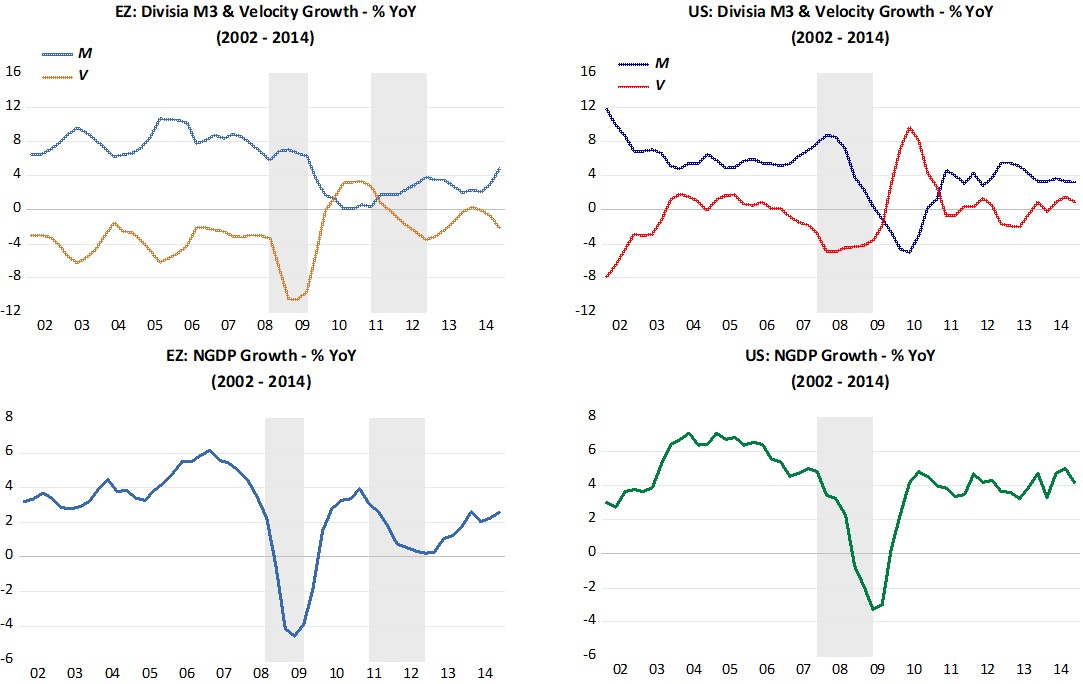
The interesting contrast here, however comes a few years later. Despite the troubles that began in Greece in late 2010, spreading to other periphery countries, affecting velocity growth in both “continents”, the ECB under Trichet thought it was time for some monetary tightening. Spending growth immediately drops in the EZ. The Fed this time around didn´t “fall into temptation”, so the US was spared.
Let´s look at what was happening to inflation to get those guys so “trigger-happy”.
The next charts show HICP alongside oil prices. We see immediately that HICP inflation in the EZ is much less sensitive to oil prices, both on the way up and on the way down. We also observe that the aggregate demand shock was so strong that it made oil price tumble after mid-2008.
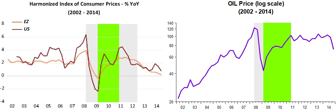
Both Bernanke and Trichet looked at the rise in inflation in 2007-08 and “despaired”. When spending began to recover, oil prices also climbed, impacting HICP inflation in both “continents”. Since the economy was already so weak and unemployment so high (10%), the Fed this time around “looked-through” the oil price increase. Not so Trichet, who reacted “violently” to a small rise in inflation above the “close to but below 2%” target of the ECB.
The period was nicknamed the “GFC” (Great Financial Crisis), but as we have seen, it would better be nicknamed “The Great Monetary Unraveling”.
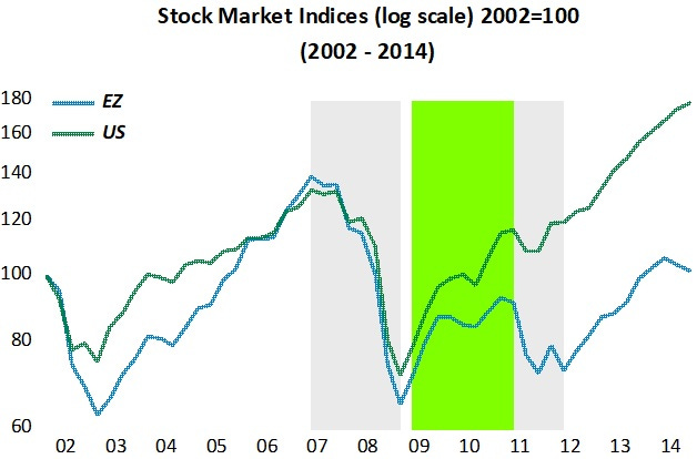
The next chart shows what happened to stockmarket indices in the two “continents”. When NGDP growth crashes, both indices take a dive. When spending begins to rise again, both indices climb. As soon as Trichet “tightens” in early 2011 due to the increase in inflation, the EZ stock index drops. Meanwhile, in the US, even with the economy “depressed”, the persistance of spending growth is reflected in the stockmarket growth.
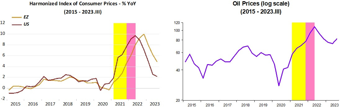
The panel below depicts the second period, from 2015 to 2023. Note how much tighter monetary policy was in the EZ when C-19 hit. While velocity growth fell comensurately in both “continents”, while in the US money growth increased sharply, in the EZ it rose little. As a result, NGDP growth fell significantly more in the EZ.
However, when velocity growth bounced back, both in the EZ and US, while money growth fell sharply in the US, it fell little in the EZ, so that NGDP climbed by an equivalent amount in both places.
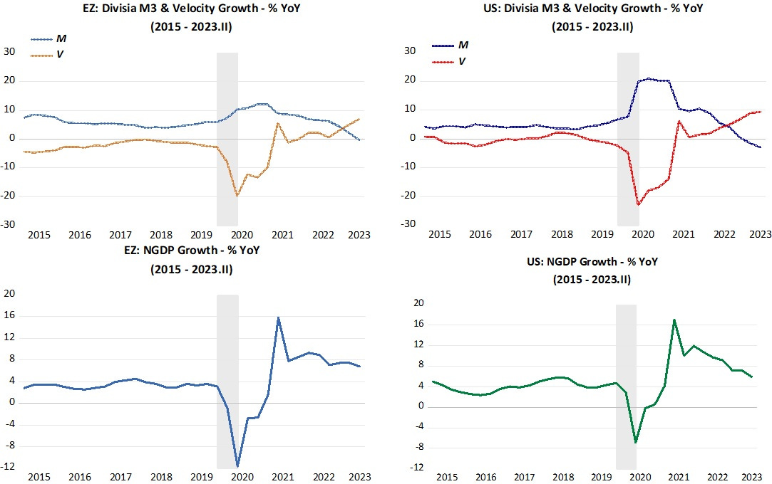
From late 2021 onwards, monetary policy has been more restrictive in the US, with NGDP growth falling more consistently.
The inflation picture is shown next. The inflation process in both “continents” look very similar, with inflation in the EZ “shifted” to the right, likely reflecting the fact that spending fell more, with inflation initially falling for longer.
The yellow band indicates that the increase in inflation was demand determined from the expansionary monetary policy that began in early2021. The pink band indicates the rise in oil prices due to the preparation and invasion of Ukraine, a bona fide supply shock.
The next panel, showing levels of both NGDP and RGDP for the two “continents” makes it clear that monetary tightening when C-19 hit was much stonger in the EZ than in the US, with direct consequence for the fall in real output (RGDP).
It also shows that as a consequence, the recovery in the US was faster. When the supply shock from the war in Ukraine hit, in the US RGDP had climbed back to the post Great Recession trend, while in the EZ it was still significantly below.
The patterns show also suggest that supply constraints or impediments from C-19 were more binding in the EZ, especially after the “war next door” happened.
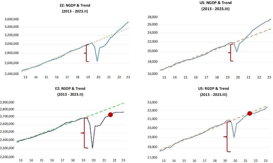
The stronger supply constraints in the EZ is also reflected in the fact that inflation has fallen faster in the US, despite the rise in real growth observed there.
The takeaway is that when monetary policy is properly specified, and not looked at exclusively from the perspective of money supply growth, it goes a long way to explain, and compare, macroeconomic outcomes.