
The mirage of 'Spiking Unemployment'
The mirage of 'Spiking Unemployment'
It´s only a pattern that the Fed creates by its mistakes

For more than 60 years, the Phillips Curve has been the backbone of macroeconomic analysis and business cycle research. For the past 30 years, its death has been pronounded several times, but those turned out to be “fake news”.
In 1999, Richard Clarida, Jordi Galí, and Mark Gertler wrote “The Science of Monetary Policy - A New Keynesian Perspective” in the Journal of Economic Literature. On page 1665 we read:
It is then possible to represent the baseline model in terms of two equations: an “IS” curve that relates the output gap inversely to the real interest rate; and a Phillips curve that relates inflation positively to the output gap.
Twenty years later, Thomas Merten and John Williams, in their contribution to the discussions for the revised “Monetary Policy Framework” which was announced in August 2020, say the same thing in a more elaborate way:
We use a simple New Keynesian model as a laboratory for our analysis. The economy is governed by a Phillips curve that links inflation to a supply shock, the output gap, and expected future inflation and an IS-curve that links the output gap to a demand shock, the ex ante real interest rate, and expectations of the future output gap.
I like to call these views as the “Gap models of inflation”.
In 2000, William Poole, then President of the St Louis Fed tried (unsuccessfully) during the June Fomc Meeting to put those views to rest (pg 61):
The traditional NAIRU formulation views the wage/price process as running off a gap–a gap measured somehow as the GDP gap or the labor market gap. And the direction of causation goes pretty much from something that happens to change the gap that feeds through to alter the course of wage and price changes.
I think there is an alternative model that views this process from an angle that is 180 degrees around. It says that in an earlier conception, either through a determination of a monetary aggregate or through a federal funds rate policy, monetary policy pins down the price level or the rate of inflation and, therefore, expectations of the rate of inflation. Then the labor market settles, as it must, at some equilibrium rate of unemployment. Where the labor market settles is what Milton Friedman called the natural rate of unemployment. But the causation goes fundamentally from monetary policy to price determination and then back to the labor market rather than from the labor market forward into the price determination. I certainly view the causation in that second sense.
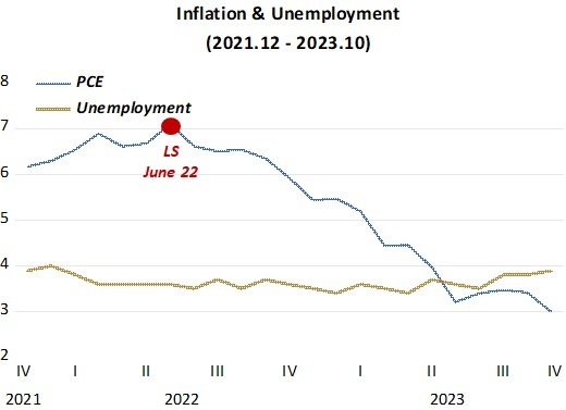
In summer 2022, Larry Summers fully embraced the “gap models”.
Larry Summers in June 2022:
“We need five years of unemployment above 5% to contain inflation — in other words, we need two years of 7.5% unemployment or five years of 6% unemployment or one year of 10% unemployment.”
Larry Summers 18 months later “doubting” the “gap models”:
We haven’t nailed the landing yet : ‘Look at underlying inflation rates… some… are still running well above 2 per cent. If inflation is currently at 2 per cent, it’s not clear that it won’t go back up again. And it isn’t clear that the landing has been soft… declining flows of credit, inverted yield curves, aspects of consumer behaviour… credit strains… raise the possibility that the landing won’t be soft…. The landing may be hard, and we may overfly. That said… hav[ing] inflation above 4 per cent and unemployment below 4 per cent, and you extricate from that situation without a recession… has never happened before in the United States…. And it certainly looks in play as a possibility…. Primary credit should be given to the Fed for having acted relatively rapidly to correct its earlier errors…. The Fed in 2022 raised rates very sharply in a way that did not take place during the Vietnam period. So I think that, ironically, if team transitory proves to be vindicated, it will only be because their policy advice was not taken. It will be because the Fed moved strongly enough that [inflation] expectations never became unanchored…
It´s even “better”. It´s “having inflation above 7% (7.1%) and unemployment below 4% (3.6%), and you extricate from that situation without a recession [a spike in unemployment]…has never happened before in the United States…”
What Larry Summers “predicted” in June 22 and what transpired:
In the same FT interview, Larry goes further in “contradcting” himself:
How do you think the Phillips curve emerges from the experience of the past few years?
Summers: First of all, one should always have been aware that a substantial part of the increase in inflation was transitory. So no one [even I] should have thought that most of the route from 7 per cent to 2 per cent needed to be achieved in ways that were correlated with increases in unemployment…
And I think it is true that the Phillips curve coefficient is looking small. So it certainly hasn’t been a glorious period for the Phillips curve theory in any of its forms. But I’m not sure we have a satisfactory alternative theory.
The theory to which many economists are gravitating to is that the Phillips curve is basically flat, inflation is set by inflation expectations, and inflation expectations are set by the people who form inflation expectations. And that’s a little bit like the theory that the planets go around the universe because of the orbital force. It’s kind of a naming theory rather than an actual theory. So I think inflation theory is in very substantial disarray, both because of the Phillips curve problems and because we don’t have a hugely convincing successor to monetarist-type theory.
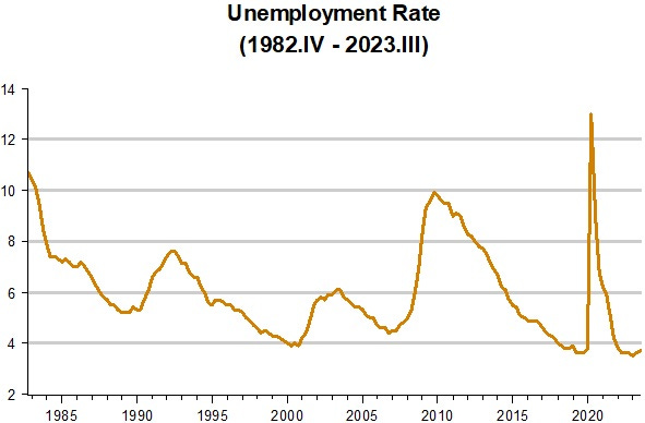
The “gap theory of inflation” has been disastruous, giving rise to the “spike pattern” of the unemployment rate as shown in the next chart.

Whenever unemployment falls to “low” levels, it spikes! Sometimes, as during the Great Inflation, the “low level” is relatively high. The strenght of the spike also varies.
Can this pattern be explained convincingly? To make things easier to see, I begin the sample after the Great Inflation, which distorts the picture. Thus, for the last 40 years, the chart looks like this:
Does this pattern occur because inflation was a threat when the spike takes place? The next chart does not “help the cause”. After falling almost continuously since the end of the Great Inflation, in the first half of the 1990s inflation becomes low and stable. The “gap fans” could argue: “that´s because a positive activity gap was avoided” (so unemployment had to spike).

In my opinion, the next chart presents a much more convincing cause for the spike pattern of unemployment.
In the chart we observe that, looking at the verticle dotted lines, whenever NGDP growth (something closely controlled by the Fed) stumbles (or crashes, as in 2008 and 2020), the unemployment rate spikes (by a little or by a lot).
Also, as indicated by the 3 shaded areas, when NGDP growth either falls from a relative high level (first & third shaded areas) or wiggles down from a stable level (shaded area 2), unemployment does not spike, only “breaking the fall” that was on course.

What´s notable in the chart above is that (after the adjustment following the end of the Great Inflation), whenever NGDP growth is stable, unemployment is on a falling trend. I refer to the quote from William Poole above:
…Then the labor market settles, as it must, at some equilibrium rate of unemployment. Where the labor market settles is what Milton Friedman called the natural rate of unemployment.
The problem is that the Fed has never allowed the labor market to settle, always getting antsy when unemployment moves below some imaginary (because unobservable) “low rate” and tightening monetary policy (meaning constraining NGDP growth). The exception is 2020, where monetary policy was “tightened by the C-19 virus” and the Fed acted proactively quite quickly and forcibly.
That´s why Larry Summers and others in the “gap theory” group got it wrong. NGDP growth is coming down from lofty levels, so the unemployment rate is stable. If NGDP growth converges to a stable (maybe around 4.5% - 5%) rate, the unemployment rate may even drop a little, settling close to 3.5%, while inflation moves down to the Fed´s 2% target.
With results so far, I think a Merry Xmas is in the bag, and I´m hopeful for a promising 2024!
Years ago, I did a paper for the Parliamentary Research Service where I graphed unemployment and inflation. It clearly showed that the Philips Curve came and went. Clearly, it is not a permanent feature.
https://catalogue.nla.gov.au/catalog/165914