
Changing patterns in housing starts
Changing patterns in housing starts
where, more recently, the contrast between "slow" & "fast" is also apparent

In a recent post, Brad Delong writes “We Are Only Now at Normal, after 15 years of sub-normality in construction”:
Single-family housing starts fluctuated around 1,200,000 a year for a generation and a half…
Then the mid-2000s boom…
Then the crash before the Great Recession…
(Note: the housing crash did not cause the Great Recession—the economy had rebalanced out of housing and into other sectors before the recession began)…
Then the most ænemic recovery in housing imaginable…
Why so ænemic a recovery?…
I discuss/qualify some of those bullet points and illustrate the patterns.
The chart below indicates that up to the late 1980s, there was a clear cyclical pattern in housing starts, which maybe led Edward Leamer to write “Housing IS the Business Cycle”.

(The gray shaded areas indicate recession). What DeLong calls the mid-2000s boom actually begins in the early 1990s, and is enhanced in the early 2000s (the green shaded region). Note that the 2001 recession does not register in housing starts. The dark bar in the Green region indicates the point when housing starts accelerates.
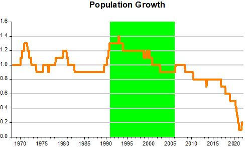
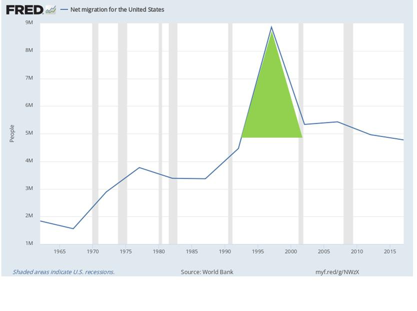
What´s behind this change in the housing start pattern in the early 1990s? The charts below show that at that point, population growth increased significantly. And behind the increase in population growth, is the strong increase in immigration.
The acceleration in housing starts in the early 2000s is related to the Asia crisis of the late 1990s. When the current account related crisis began, the adjustment required that the Asian countries move to a current account surplus. To do that, those countries had to reallocate resources from the non tradable (say housing), to the tradable sector.
Other countries, in particular the US at the time the fastest growing large economy, would have to reallocate resources from the tradable to the non tradable (say housing) sector. The chart below shows that this happened, with the US current account of the US moving deep into deficit.

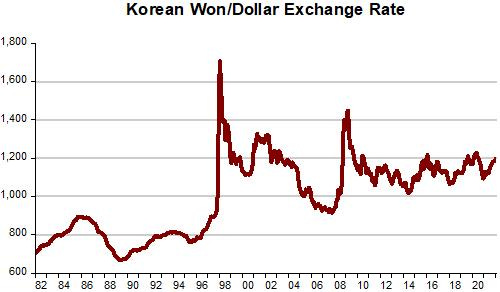
To enable the required adjustment, the dollar had to appreciate relative to the Asian countries (here with the Korean Won as “stand-in” for Asian exchange rates).
The long rise in housing starts (green shaded area) is well explained by 1. population growth, 2. current account adjustment and 3. the Great Moderation (which provided the required macroeconomic (both nominal & real) stability)).
Delong correctly notes that the housing crash did not cause the Great Recession. He argues, also correctly, that the economy had rebalanced out of housing and into other sectors before the recession began.
When housing crashed, unemployment continued to fall.
With the loss in employment in residential investment being picked up by the rise in exports and non residential investment.

I move to Delong´s last two points:
Then the most ænemic recovery in housing imaginable…
Why so ænemic a recovery?…
The charts provide an answer. In practice, the “most anemic recovery in housing” is the counterpart of a very anemic recovery in aggregate nominal spending (NGDP).

A very different housing start recovery is clear after the pandemic recession. And that´s because aggregate nominal spending (NGDP) recovers quickly!
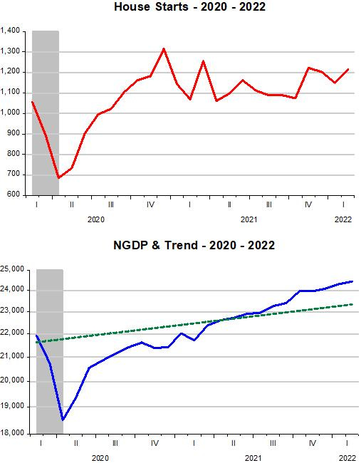
For the most part, the Fed has done a good job “neutralizing” the pandemic effects on the labor market, as I showed last week, and also in the housing market (other impediments to a more satisfactory housing market (building restrictions (NIMBY), etc) are outside the scope of its mandates.